Bank of Marin Brand Revitalization
Project Description
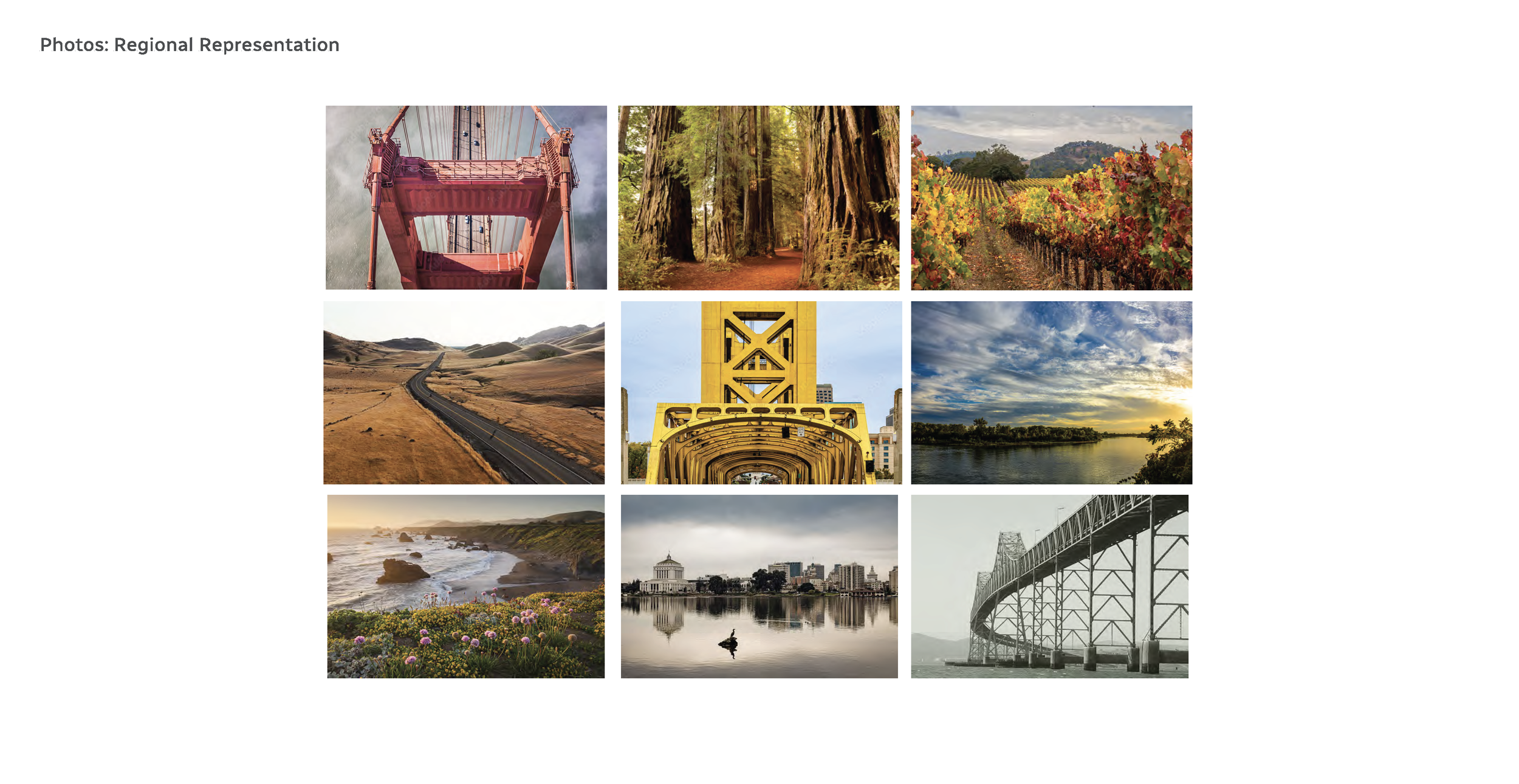
Bank of Marin was seeking a more modern visual direction to support an upcoming website refresh and appeal to a younger, more digitally savvy audience—without changing its long-standing logo or signature green. They wanted a brand expression that felt contemporary, flexible across print and digital applications, and reflective of a broader Northern California identity that resonated in Marin, the East Bay, Sacramento, and the Sierra Foothills. The refreshed direction also needed to align with recently updated branch interiors, which introduced lighter wood tones and a more modern aesthetic.
My Role
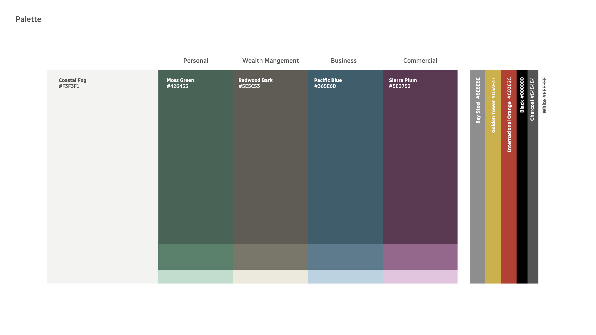
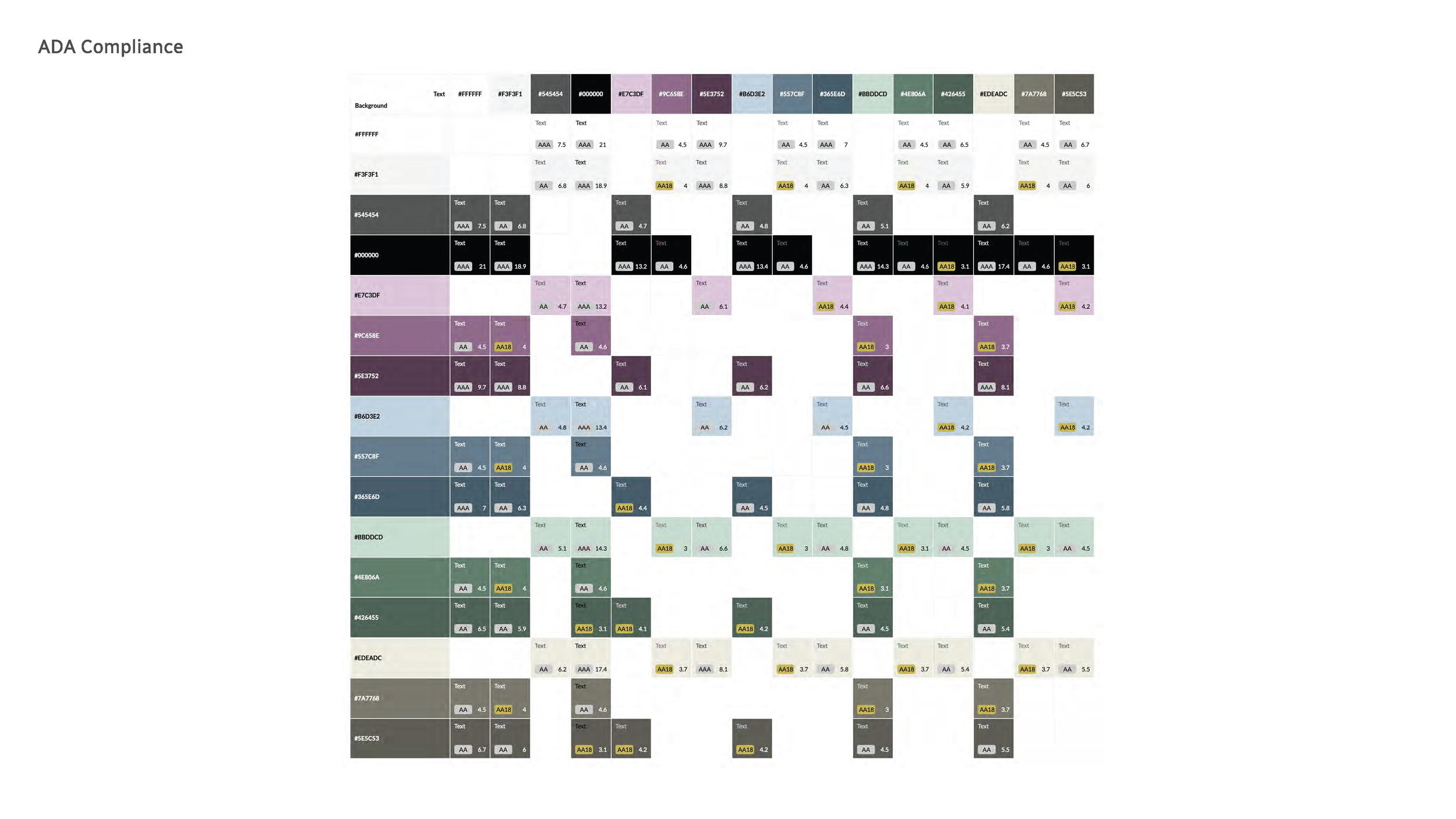
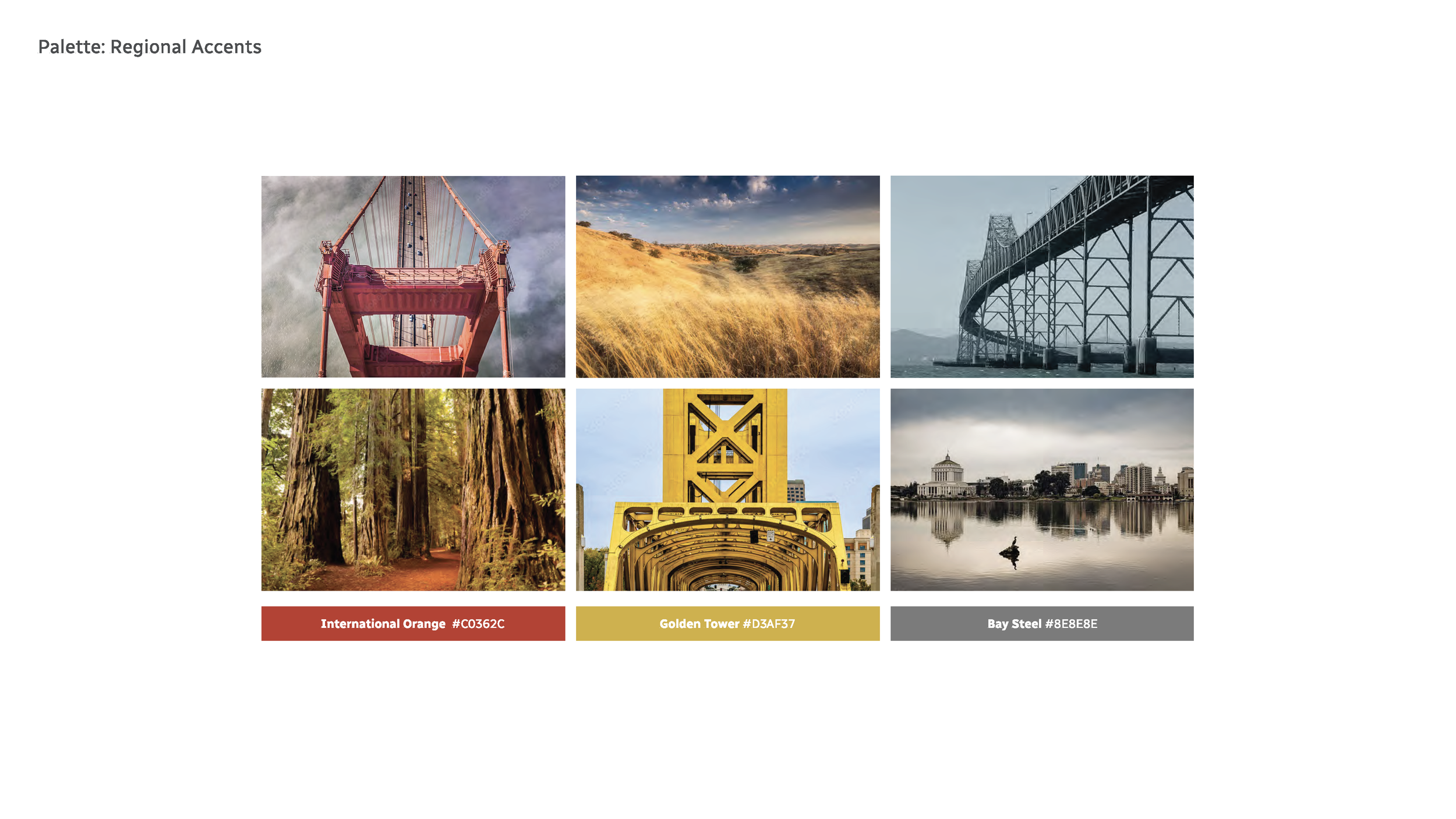
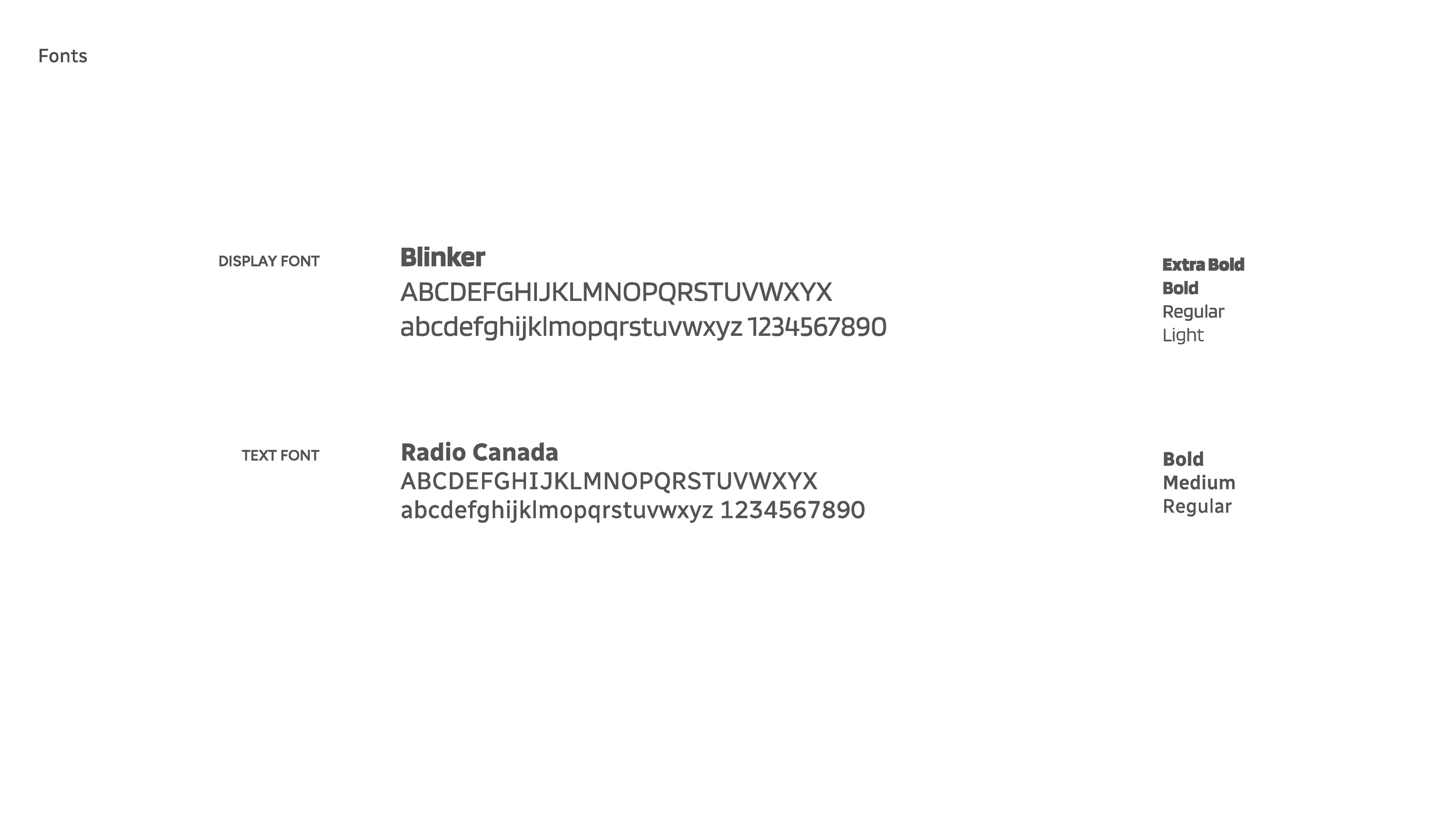
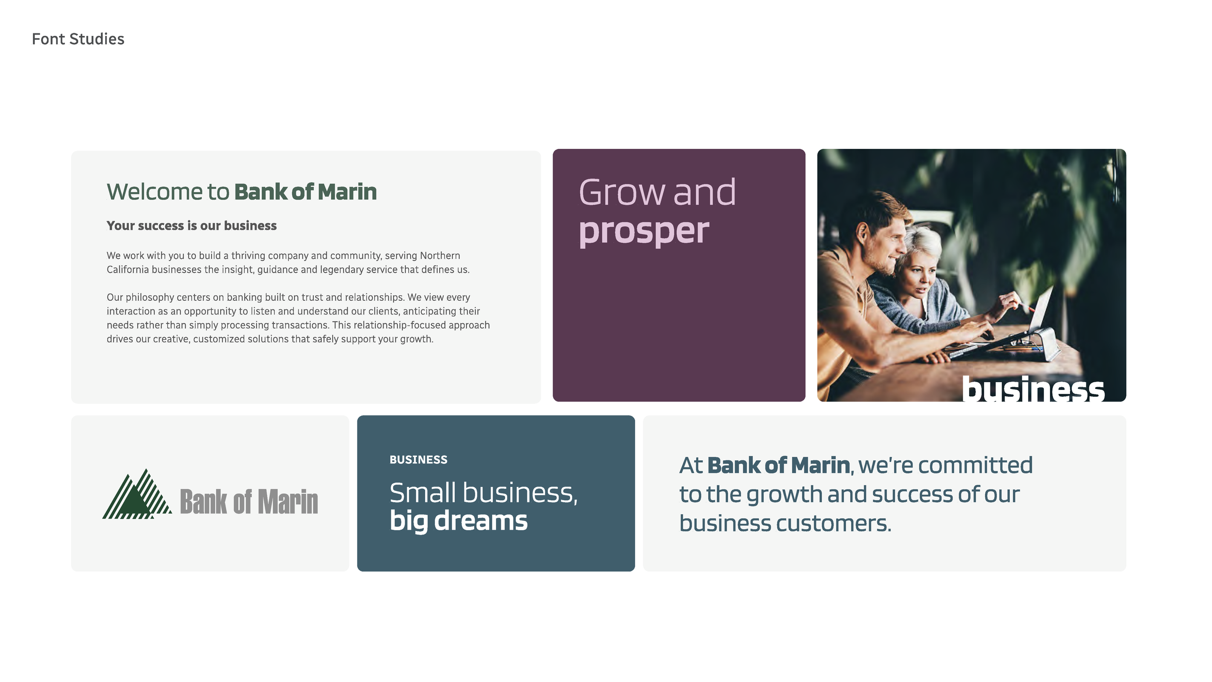
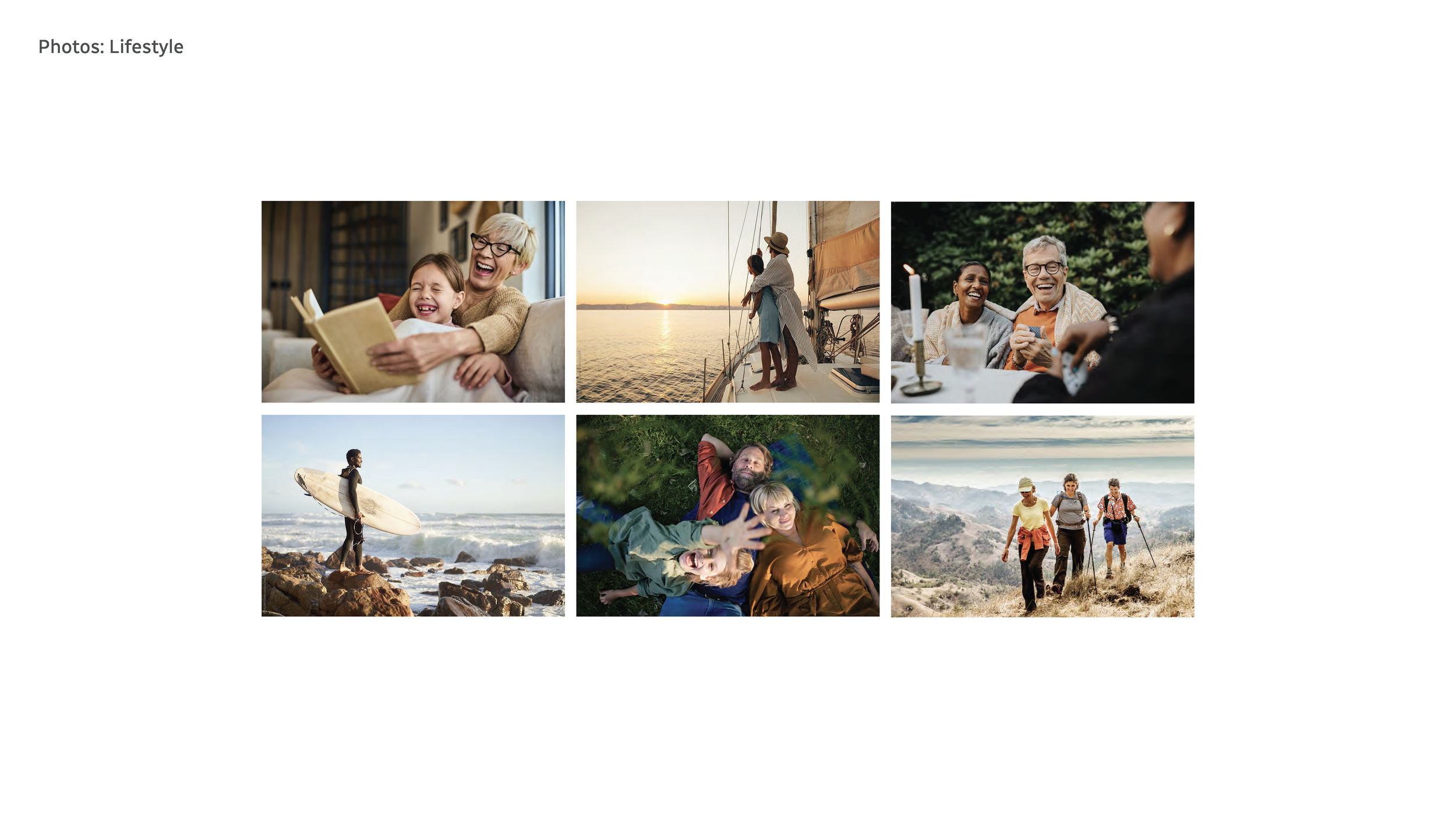
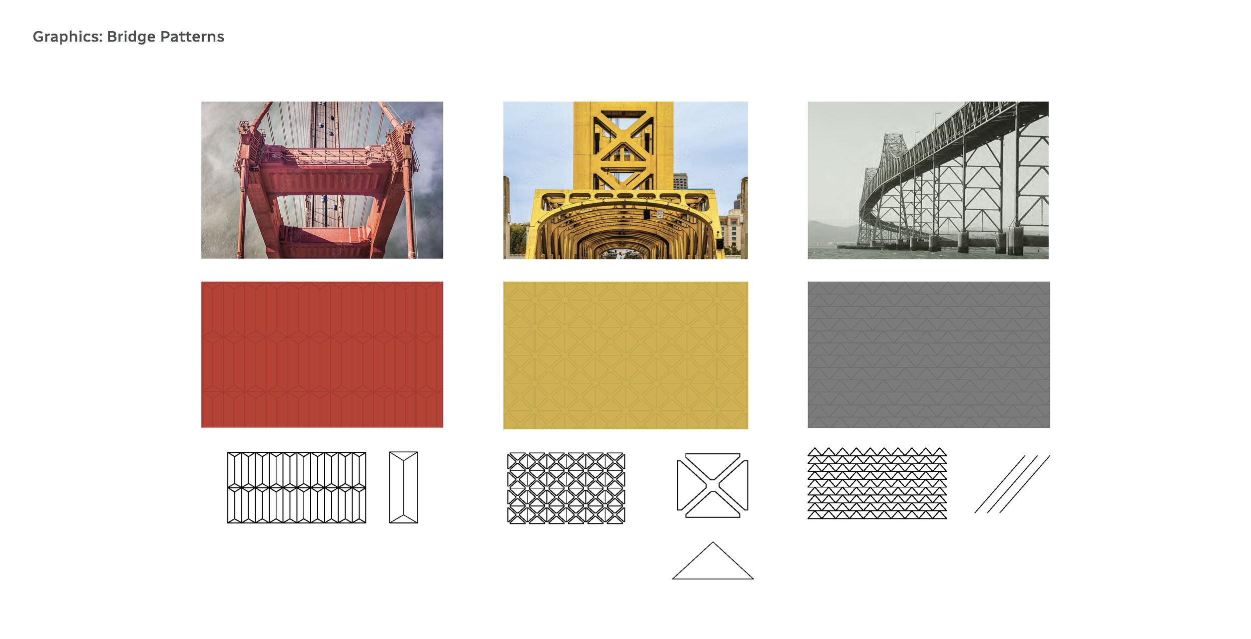
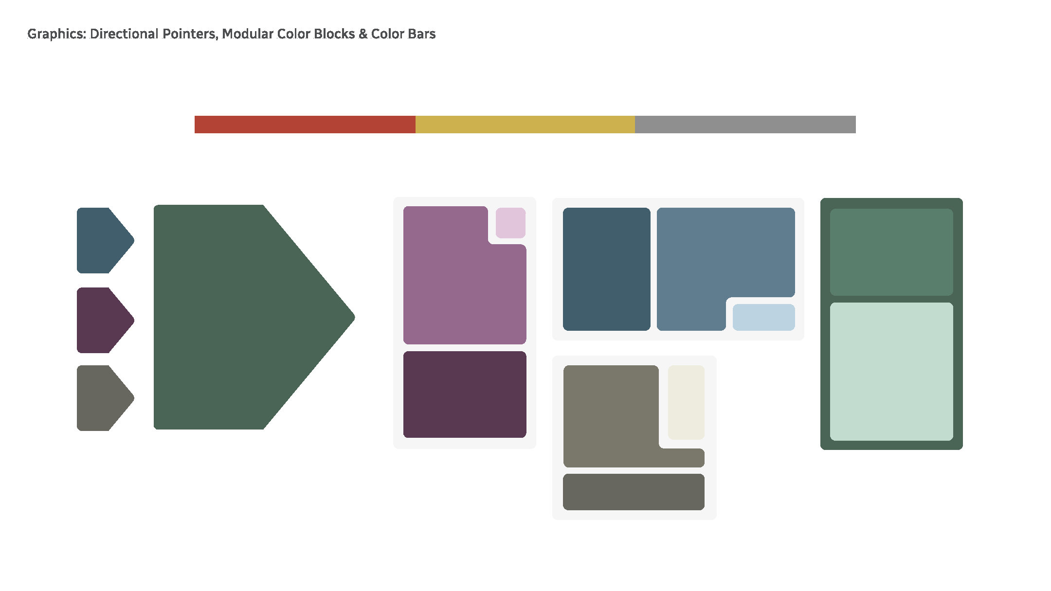
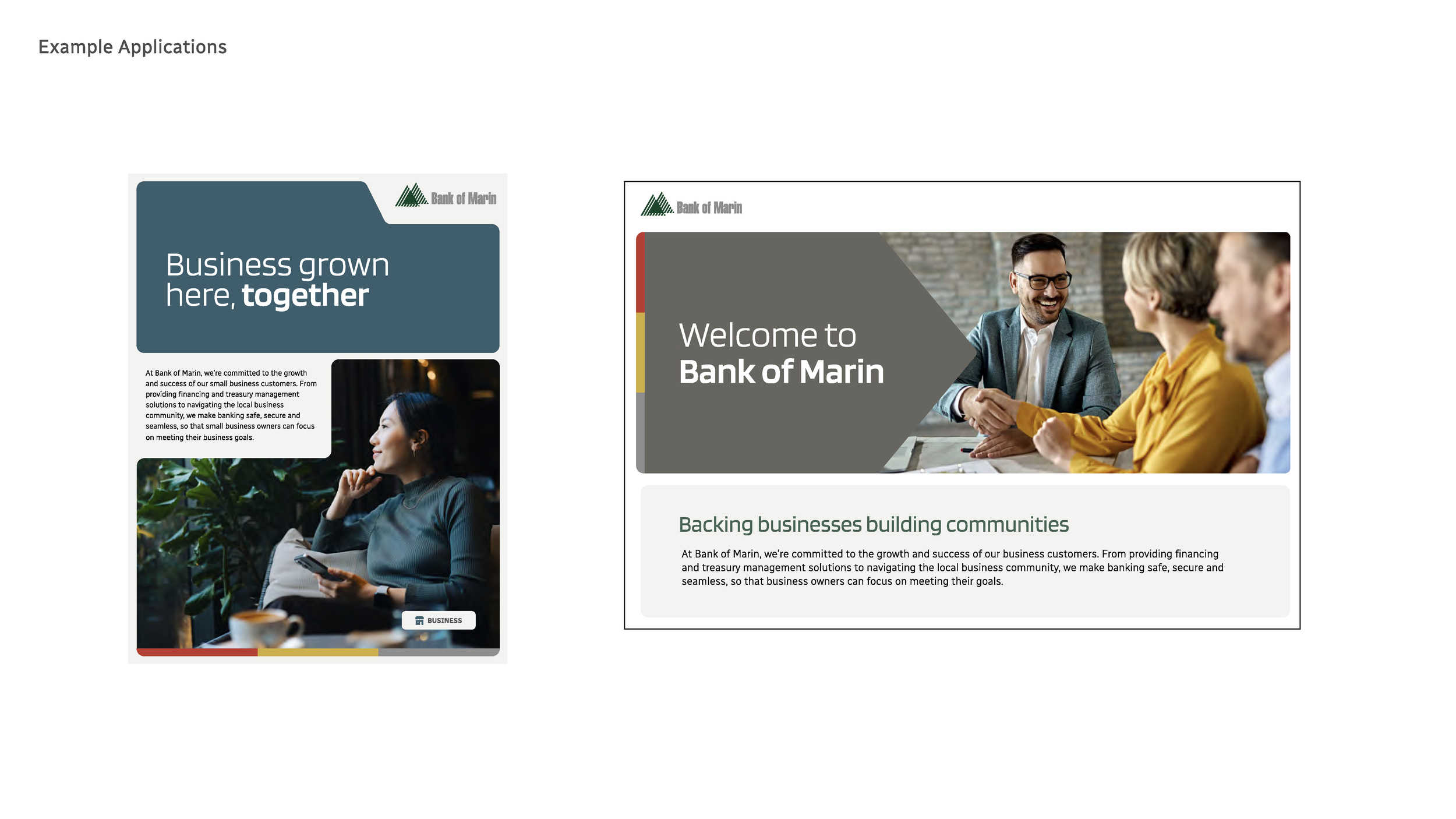
As a designer, I developed one full brand refresh direction. I began by researching competitors, reviewing the renovated branch interiors, and gathering design inspiration through swipe files and Pinterest boards. To unify the bank’s diverse regions, I built the concept around “connections,” represented through stylized graphics of iconic Northern California bridges (Golden Gate Bridge, Richmond–San Rafael Bridge, and Tower Bridge). I created a pattern system using these bridge forms, developed an ADA-compliant primary color palette with saturated tones aligned to the interiors, and assigned colors to each line of business. A secondary palette was pulled directly from the bridge hues. I introduced a bold sans-serif typeface for a more modern feel and designed a thin tricolor rule as a simple branding element tying the three regions together. Additional graphic devices—rounded squares, rectangles, directional arrows—and a rich, slice-of-life photography direction formed a modular system flexible enough for both print and digital use.
Results
While the client ultimately selected a different direction, several components from this concept—particularly elements of the color system, modular graphics and bridge—are being incorporated into the brand evolution currently underway.
